
Ana Navas
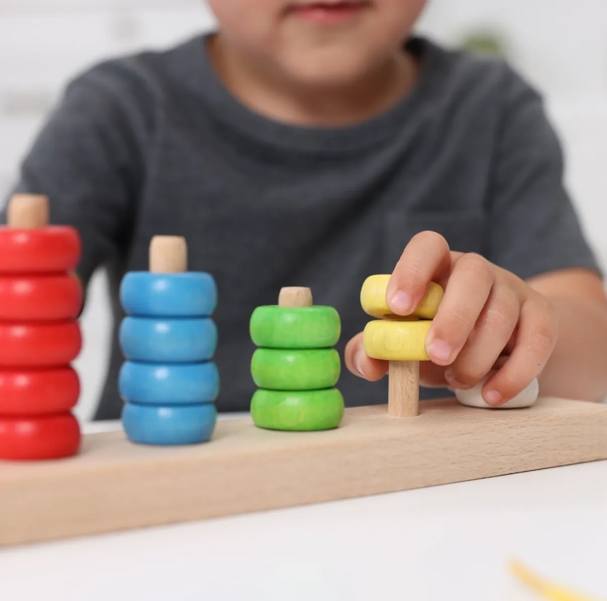
Ana Navas is a speech therapist who wanted a presence on social media and online.
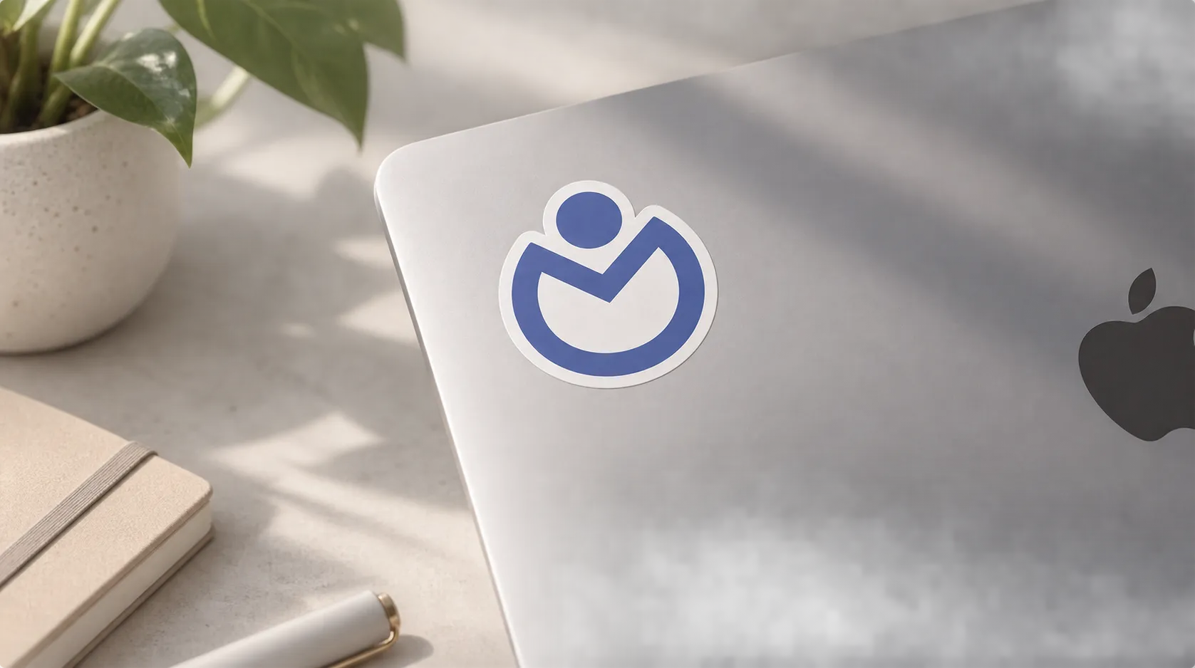
Wownder developed the naming, brand identity, logo, brand manual, website, social media, stickers and digital assets for the project.
We built an online appointment booking system, which turned her practice into a service with global reach, independent of her patients' physical location.
The creative direction
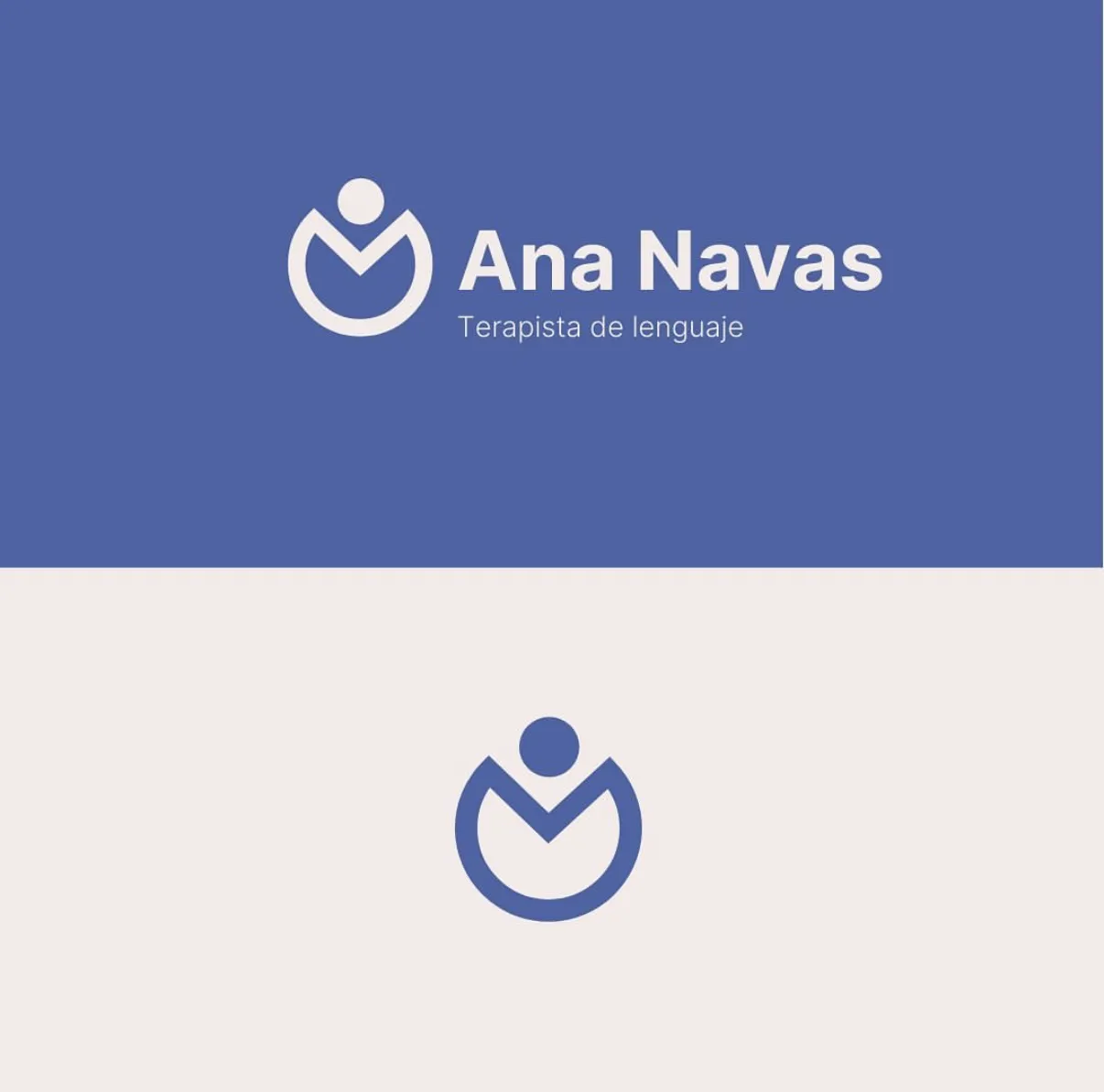
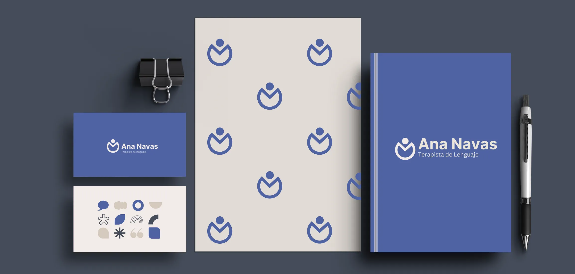
ConceptThe symbol combines a human figure with a gesture of listening and holding space — a direct reference to the therapist-patient relationship. A warm blue palette and organic shapes communicate closeness and trust without losing professional seriousness.
Brand system
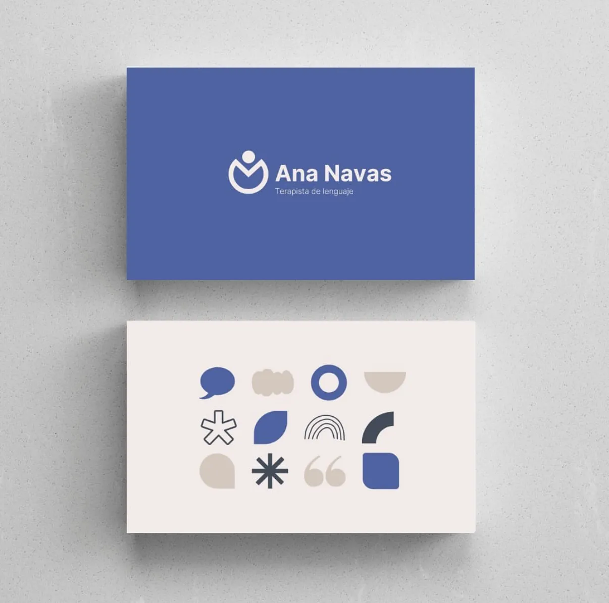
Visual systemWarm blue as the primary color, cream as the base, and dark blue as the contrast.
A warm, highly legible geometric sans-serif for the logotype and the site.
Simple organic and geometric shapes for brand and social pieces.
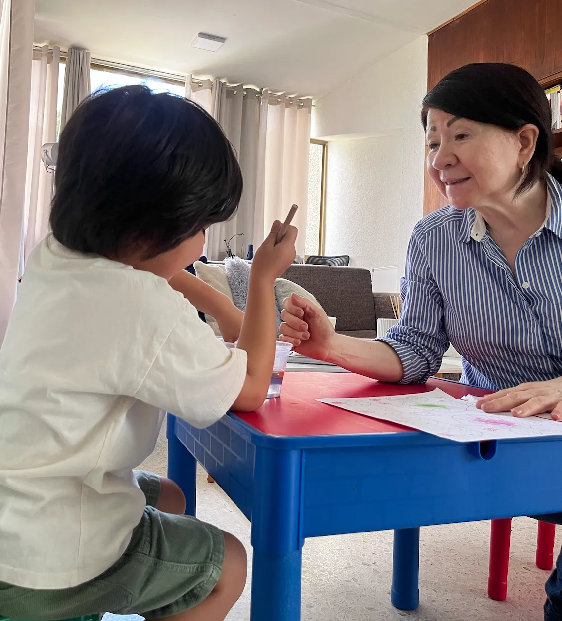
Real session photography, close and human.
Brand applications
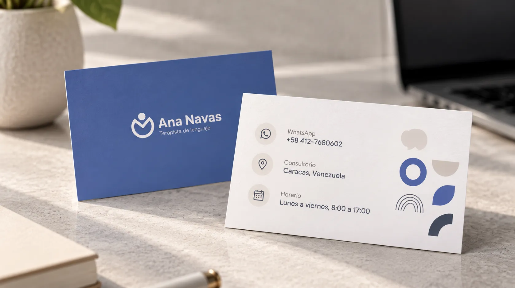
Website & materialsThe identity carried over from the brand manual to the website, business cards and Instagram profile, keeping the same visual language and warm tone at every touchpoint.
Result
ClosingAna Navas went from having no digital presence to a complete brand identity and a website with online appointment booking, which let her see patients beyond her physical location and present herself as a professional with global reach.