
La Curry Mile
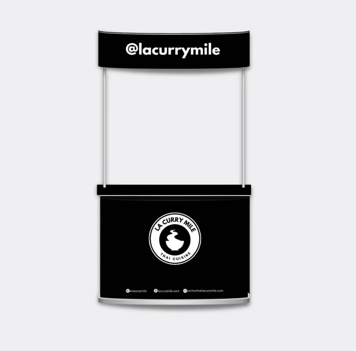
La Curry Mile started as a Thai street-food concept in Venezuela, with no brand, no visual system and no digital presence.
The challenge was building a complete identity from scratch: a name, a symbol, a color system and a coherent physical and digital presence for a food business that needed to stand out in a market saturated with generic options.
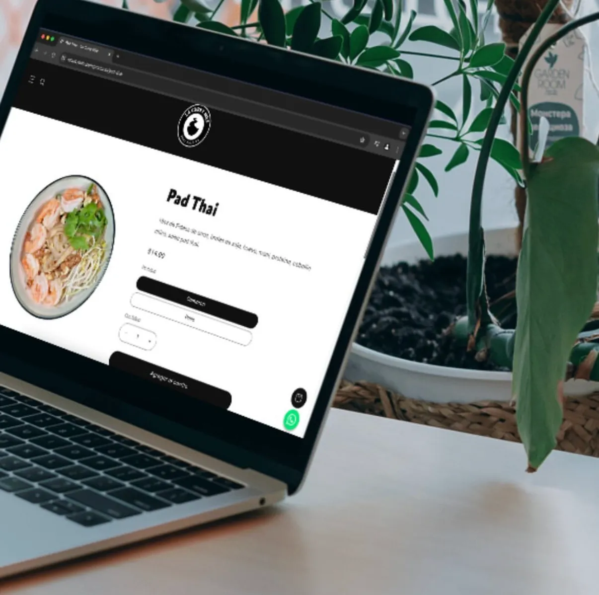
Wownder developed the naming, the full brand identity, the brand manual, the e-commerce, the sales stand design, stickers, packaging and the project's digital assets — from idea to point of sale.
The creative direction
ConceptThe concept starts from a play on words with "Curry Mile" — the famous Southeast Asian food corridor. The visual direction pairs a rounded, friendly typeface with an editorial black background: the closeness of street food with the seriousness of a brand that takes itself seriously.

Brand system
Visual systemEditorial black, warm white, and curry red as an accent.
A rounded, friendly sans-serif for the logotype and brand pieces.
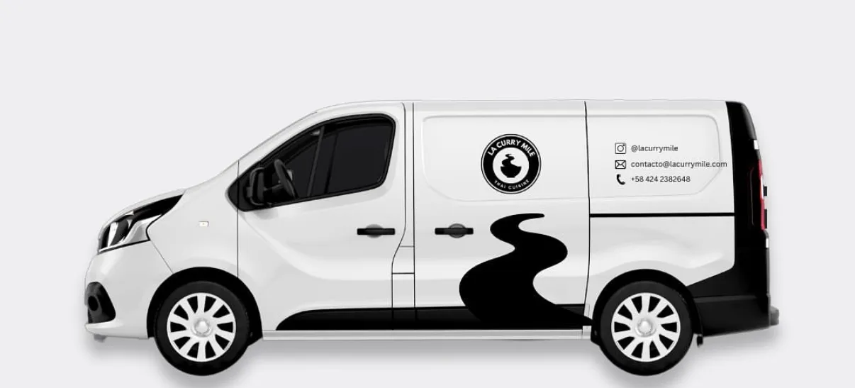
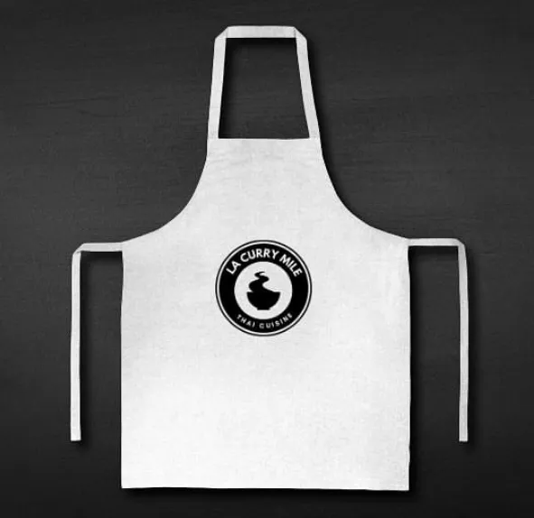
A circular seal, simple lines and solid shapes for packaging and stickers.
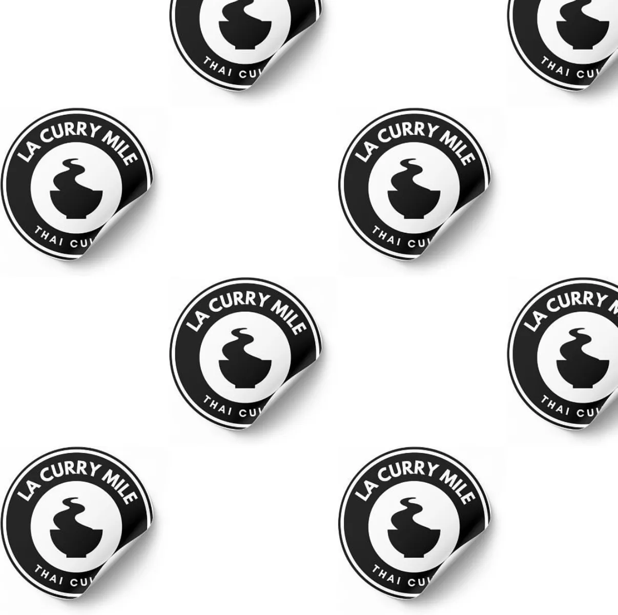
Real photography of physical brand applications.
Brand applications
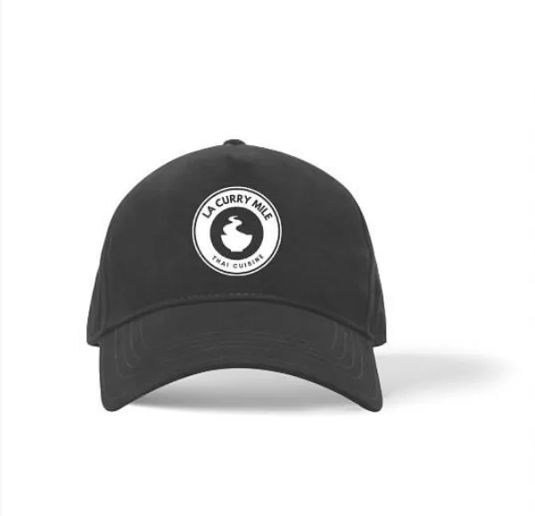
Website & materialsThe identity carried from the physical point of sale to e-commerce, packaging and digital communication, keeping the same system at every touchpoint.
Result
ClosingLa Curry Mile went from a shapeless idea to a complete brand, with a coherent physical and digital presence at every touchpoint — from the sales stand to the packaging. The restaurant no longer operates, but the project remains a clear case of how a well-built identity gives a food business structure and clarity from day one.